Oct. 21, 2019, 2:54 a.m.
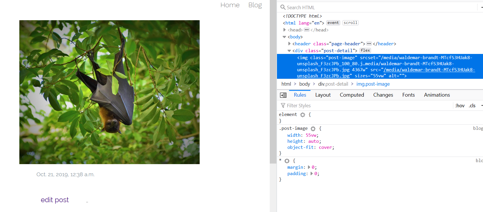
Responsive images. Part III
Added the elements from the weather app to the blog, project and front pages. The most difficult part was tracking down all the places it needed to be changed.
Initially, I only added a srcset attribute. I was a little disappointed that the browser kept choosing the largest or second to largest size. Coming back to it today I see that the sizes attribute was easy to use. I thought it was only applicable when using a media condition (max-width:480px). but all I needed to do was enter the image size. I was even able to use relative widths. Very simple, very cool.
Next: merge with master.