Adventures in Graphing
I've been working on a weather logging addition to my website. I took a weather course a few months ago and decided to do the logging on my site rather than on paper or in google sheets. It seemed like a decent way to combine web development with an elective.
It's working ok. The only issue I'm having is showing the data. It's in a big ugly table. Which is ok on desktop but not very nice on mobile. I decided to try to do some data visualization tutorials in an attempt to find something that might work to present my data better.
The course I found was super basic. But, it turns out I needed that level. I don't know my way around graphs very well.
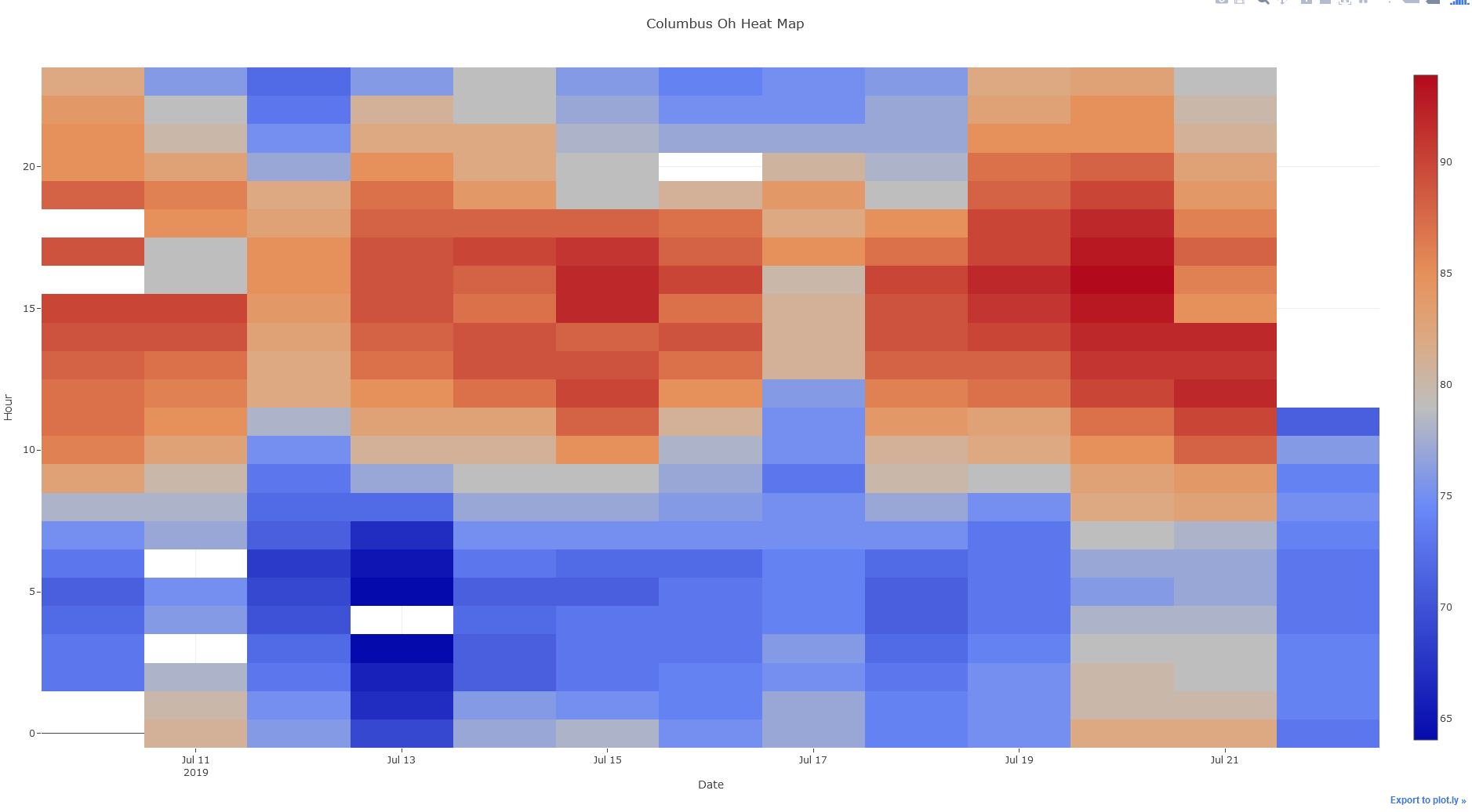
I'm a few days into the course now. I've been applying it to the data I've been working with. The heat map won't solve my issue, but it was my first attempt to work with live data.